
Color psychology is the study of colors concerning the human psyche. It helps to know how a user perceives your brand and is indispensable to your brand strategy. Just like every brand has its unique voice, it also has a unique color which resonates with the audience connecting with them emotionally. Done right, color psychology can reinforce and lead your brand to the top or vice versa!
Every color triggers an emotion that designers have to identify and employ to establish a seamless connection with the brand.
In this post, we will explore how brands use color psychology and know the meaning behind some of the most popular colors used and why.
Color Psychology in Branding
Color Psychology is a language of color that stimulates feelings and emotions to the brain much faster than any words or shapes. In the marketing world, color psychology is associated with how color impacts user behavior over preferring a brand or making a purchasing decision. It provides a structure to determine how and why a user interacts with a brand.
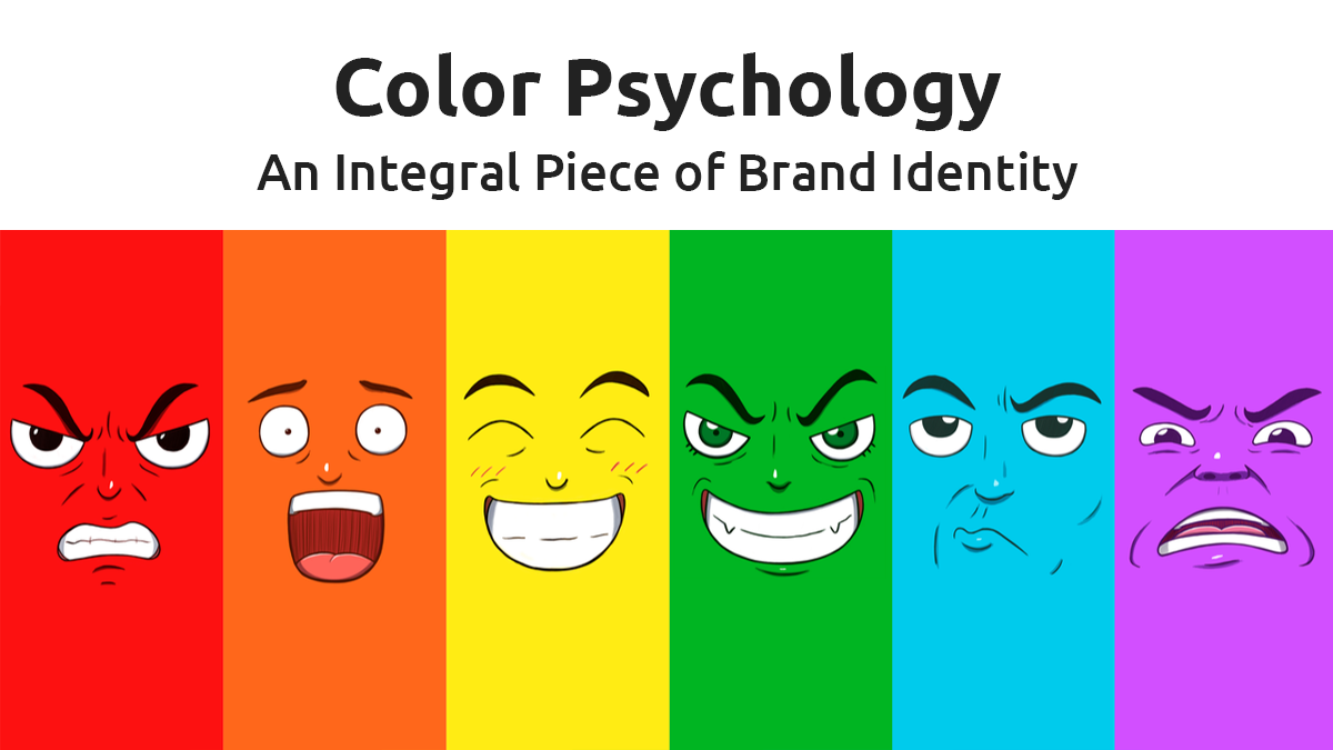
What Each Color Has To Say ?
Psychology of Blue Color
The color blue tops the chart in popularity for its subtle, tranquil, and secure vibe. Due to this reason, most corporates like IT companies, real estate firms, among others vouch on blue color for their logo and branding collaterals. Blue symbolizes a sense of trust, stability, intelligence, and reliability that complements those brands who wish to project these emotions in the form of colors
Psychology of Red Color
The second best color to bank on has to be red. It’s a universal favorite of all designers across the globe and is widely used by top brands like Coca-Cola, KFC, Nescafe, and many more. Aside from that, It is also suitable for the retail industry and marketing firms. For example, YouTube. The red color implies passion, zeal, aggression, and action. It has a magnetic effect that invokes stronger emotions in the user prompting them to take action.
Psychology of Green Color
Green falls under the cool tone category. It symbolizes nature, health, and healing. Green color gives a soothing and calming effect on the user’s mind, body, and soul, and therefore is an ideal pick for health, agriculture, and wellness brands. Deeper shades of green denote elegance & luxury.
For instance, you may have noticed how Starbucks, the premium coffee brand uses a darker shade of green in their logo to depict its opulence.
Psychology of Yellow Color
Yellow is the color of creativity and optimism. It’s associated with joy, hope, and sunshine. Perhaps, because of its ability to capture the user’s eyes from distant, just like the sun. The yellow color is a good choice for parenting and wellness websites. Aside from that, many food chain businesses also use yellow as it outlines happiness and amity. One such example is McDonald’s.
Psychology of Orange Color
Orange symbolizes youthfulness and wit. It emits excitement, enthusiasm, and warmth. It has the components of both Yellow (Joy) and Red (Passion) in it. Neil Patel, recognized as a top 100 young entrepreneurs by President Obama, chose an orange color to make his website stand out. The color is a strong choice for digital marketers who want to persuade users to take any action, followed by red.
Psychology of Purple Color
Purple is the most versatile hue in the color palette. It comes in varied shades that illustrate different connotations. Purple signifies royalty, sophistication, power, and magic. The softer shades of purple have a more feminine touch, which makes it a go-to color for cosmetic brands. Though the darker shades of purple represent sadness and frustration. The world-famous brand Cadbury has redefined it into a joyous and cheerful tone. An interesting fact is that Cadbury’s brand color, Pantone “2685C” shade is officially recognized as Cadbury purple.
And now finally comes the big question…
How to select the right color for your brand?
Although every color defines a purpose, it’s crucial to remember that symbolism of color varies as per your experience, culture, gender roles, and perspective. Therefore, it is imperative to know how a color interprets the message across all the aforementioned parameters.
Here are a few questions to ask yourself before you finalize your brand color.
- Which gender is your brand is focused on?
As we all know that both men and women have different perspectives on color schemes. Men love blue while and women adore pinks and purples. In contrast, youngsters, however, prefer more bright and jazzy colors like Orange. See, how the age group plays an important role here.
- Is your brand more aligned on serious tones or playful?
While choosing your brand, it is important that you understand the tone of each color. For Instance, blue symbolizes a serious and mature tone whereas, yellow is more inclined towards playful tones.
- Is your brand affordable enough or luxurious?
Darker shades like burgundy, black and deep green indicate richness and luxury while orange color stands for affordability.
- Is your brand too loud or subdued?
For brands that are loud and out-there should go for the power color red. On the contrary, subdued brands should pick light and soft shades like baby pinks and grey.
In conclusion, while many industries follow the trend of going with the common colors, there is always a scope for little innovation where you can pick a unique color that blends with your brand voice. Who knows maybe you too end up discovering a unique color like Cadbury!